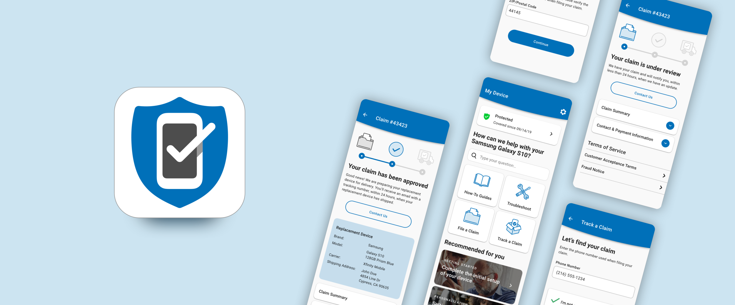
Xfinity Mobile Claims Tracker
Pocket Geek, September 2020
Background
Pocket Geek Mobile is the app Xfinity Mobile customers use to manage their phone insurance and protection features as part of their plan. We had recently created an experience that allows Xfinity Mobile customers to file an insurance claim for their phone within our Pocket Geek app.
Objective
I was tasked with completing this claims experience so that Xfinity Mobile customers could track the status of their insurance claim after having filed one.
Kickoff and planning
I first reviewed our goal with our product team. How might we support Xfinity customers to efficiently track a filed claim? Our team then identified a few constraints to consider moving forward.
There were currently a few business and technical hurdles before we can connect an Xfinity customer’s claim details with their account in the Pocket Geek app.
Assurant has a new responsive web portal to search for and review an active claim for Xfinity Mobile customers.
After aligning with stakeholders, we prioritized using this web portal in our app for the first phase MVP. We could then deliver these claims features months earlier and build upon what we learn.
In a future phase where we could connect claim details with the customer’s account in Pocket Geek, we ideated what a potential vision could look like.
The step to find the claim could be removed
Claim details could be visible at a higher level on the main device tab
We could use other Pocket Geek features to compliment the holistic user journey based on the claim status
App notifications could provide status updates when the app is closed
Testing the existing experience
The Assurant web portal would serve as a great prototype to understand what information Xfinity Mobile customers find most useful when reviewing a filed claim. This experience currently displays a lot of information in a mobile view, making the page scroll a bit long and distracting. I launched a forced ranking test to understand what information customers found most valuable and where the current design excels when reviewing a claim.
We learned that the information more directly related to the status of the claim and what to expect next were viewed as most important. Documentation referencing the filed claim were not as important in the moment of checking a claim status, but still identified as valuable to have in case they needed contact someone for help.
Prototyping and measuring success
I aligned the styling with our design system to promote recognizable interactions and consistency with the Pocket Geek brand. Based on what we learned from testing, I organized the hierarchy of information so that the most valuable details were visible and glanceable. Other details were labeled appropriately and condensed using accordions so that they could still be referenced when needed.
I tested each claims status to understand how successful they were. Success metrics we looked for were if users clearly understood the status of their claim, what to expect for next steps, and expectations for how long it would take. We learned that if the claim status description was too long, then some users would not read all of the information. This would result in varying expectations for next steps, so we made sure to keep this description brief and glanceable moving forward.
Implementing what we learned
All design assets that were aligned with our design system were prepared for handoff with engineers. I provided feedback and direction as this experience was built out in the Pocket Geek app.
The next phase for this experience is planned on the product team roadmap to review all user feedback, analytics, testing, etc. to determine the best path forward towards our vision without the current technical hurdles.
